Round #2 of ONS All-Cause Mortality Data Analysis
Today, I have analyzed the UK ONS All-Cause Mortality data for England in two additional dimensions. If you haven’t read my first article, please check it out here. First I looked at all-cause mortality by vaccination status & sex, and secondly by age group and vaccination rate, and change by month from 2021 to 2022.
Summary
By gender and age group, unvaccinated mostly show lower mortality rates than vaccinated. That is, in contrast, to the aggregate rates analyzed earlier, which points towards fundamental issues in the provided ONS dataset.
Age groups with less vaccination saw a strong decrease in all-cause deaths, while, elderly with high vaccination levels, saw no change or even an increase, which might indicate, that the data is flawed as well, or the vaccine might not be beneficial.
By Sex
Let’s start with a single age group, here I picked 80-89, as it’s one of the most obvious. This chart plots the Age-standardized mortality rate per 100k person years, as provided by Office for National Statistics UK (ONS).
We can see, that the unvaccinated rate appears relatively flat. The rate of the vaccinated starts out lower, then sees a huge jump, until it comes down again, but still remains higher than those of the unvaccinated.
First Dose
Second Dose
Booster
As you can see, most of the dashed lines (unvaccinated) are below the vaccinated, which indicates, that they would have a lower all-cause mortality rate. This is in complete contrast, to the aggregate rates the ONS has provided, and that I have charted in the first article on this topic. This points towards severe data or methodological issues in the provided data.
By Age Group and Vaccination Rate
Secondly, I looked at overall mortality by age group and vaccination rate. The bars, represent all deaths and the red line, the vaccination rate in the specific age group.
By age group, we can see some interesting pattern, namely that deaths decrease in the lower age groups (lower vaccinated), and appear to increase in the upper age groups (higher vaccinated).
Let’s focus on the highest and the lowest age group.
First, vaccination rate in seniors is very high, over 90%. Despite (or because?) the high vaccination rate, deaths kept trending higher during the last two years.
The number of deaths, increased from about 8,000/month, to about 10,000 per month.
In contrast to that, in the 18-39 year olds, vaccination rates started rising later in time, and also peaked at about 70%. The number of deaths, however, has dropped from 800-900/month, to only about 300 per month…
Obviously seasonality plays a big factor, but even comparing the same months of 2021 to 2022 this trend holds true. <60-year-olds saw a massive decline in deaths, while >80 saw an increase in absolute deaths.
Hence, with an extremely high vaccination rate, the elderly saw an increase in deaths, while with a higher share of unvaccinated the younger saw a decrease in deaths.
Since this ONS dataset, appears to be completely flawed, these charts should clearly be taken with a grain of salt.
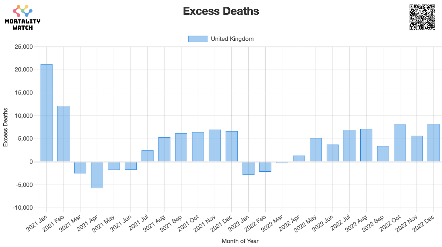
Here are the actual raw and excess deaths:
Let me know what you think in the comments!
Data & Calculations
Data & Calculations can be found here: https://github.com/USMortality/charts/tree/uk/covid19/gbr


Did you see the update today where they admitted the male and female labels were inverted? https://twitter.com/ClareCraigPath/status/1629093945362853888?s=20
I think that the "kill shot" will be the lethality by manufacturer.
Anyway as you say, the data is flawed. Per the YouTube - Norman Fenton with John Campbell -yesterday, the first (and most lethal?) months of vaxx roll-out in 2021 has been dropped because "2011 v 2021 census data" - data for under 18's has been omitted and errors in the split between vaxx and unvaxxed - calculates too low a number of unvaxxed, hence piling on more casualties into the unvaxxed bucker - the denominator - that should be attributed to the "ever vaxxed" bucket.
In the back of my mind is the work done by Messrs Neil and Fenton and reviewed by German Professor Kuhbandner commented here
https://notrickszone.com/2022/01/21/analysis-by-german-prof-thousands-of-hidden-deaths-daily-may-be-greatest-medical-debacle-in-human-history/
referring to this
https://www.researchgate.net/publication/356756711_Latest_statistics_on_England_mortality_data_suggest_systematic_mis-categorisation_of_vaccine_status_and_uncertain_effectiveness_of_Covid-19_vaccination
Thank you for your diligence and patience in helping the Brits out of their data ineptitude, obfuscation and deflection from crimes committed by politicians and health regulators with a complicit medical industry.
Just imagine if, in a perfect world, we could reconcile "deaths with Midazolam and Morphine present, contra-indicated by overall health and treatment with IVM/HCQ"
Onwards!